
On Ink
A hatching lesson.

[Substack is warning me about the length of this post with respect to email. There are a lot of pictures. Please consider clicking through.—FE]
Holly MathNerd wrote a brave post recently about how she failed at ink drawing on a commission.

The subject was a hummingbird.
I can see, without straining, what is wrong with the hummingbird. There is essentially one value across the whole bird — no light source, no shadow, no modeling. The chest is a flat blue scribble where, in colored pencil, I would be layering six or seven hues for iridescence. The branch is a stick. The white acrylic-pen highlights are doing far too much load-bearing work; in colored pencil, value gradations would handle most of that, and the white would be a final accent rather than the only reason you can tell there’s dimension here at all.
Bad news first—failing is terrible, failing in public is extra-terrible, failing on a commission is two cups of sour milk on a bowl of Cringe Flakes. The good news is that the above analysis of what was wrong with the drawing is flawless. It describes the problems exactly.
MFA programs usually have you teaching a basic course on drawing or design. At a generalist liberal arts institution like the one where I obtained my MFA, students typically ended up in Drawing 101 because they couldn’t sing and were too shy to act. I observed that the room divided itself into three groups after a couple of weeks. There was one kid, maybe two, who could draw really well. Everyone knew who they were. Most of the rest of the room were kids who could not draw so well. When you pointed out problems in their drawings to fix, they would do it, but not with any great enthusiasm. The remainder, maybe another one or two kids, couldn’t draw any better than the second group. But when they realized they had gotten something wrong, they would gnash their teeth and growl. Then they would fix it, all the while suppressing screams at their sheer deficit of talent.
It was the last group that was most likely to produce artists. Holly, I can tell from her post, is in that group.
I was a fifth-decile draftsman at art school. What I had instead was an instinctual commitment to art-making that came from I know not where. I am still making art, and classmates who could draw circles around me have largely stopped. I think that when skills come too easily, they feel like they’re not worth doing. Sometimes skills that don’t come easily are also not worth doing, and that’s another problem. You usually don’t know that until you’ve gone through some effort to acquire them.
Impressed by the astute scrutiny of her own drawing, I emailed Holly to say I could solve several of her problems with pen in a 20-minute video call. She replied that she would, but she was having problems with her hearing aids. This is one of the reasons for her ambitious commission-seeking: to raise money for new devices. With her permission, I’m writing this lesson out in visual form instead, so she can read it, and so I can encourage you to sign up for Holly’s consistently amusing and interesting Substack as a paid subscriber. Do it, please, it’s a mitzvah.
Hatching
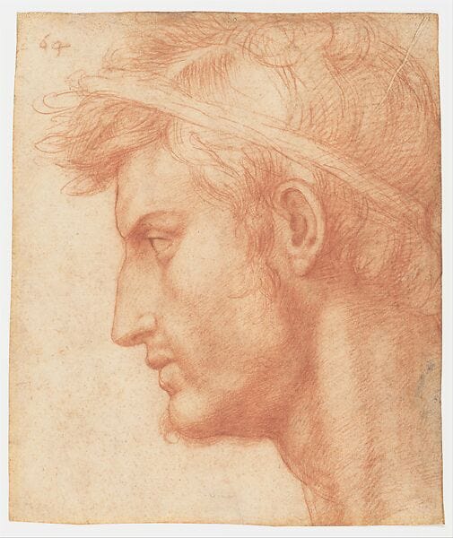
When modeling form in pen and ink, you have two options. The first one is hatching, which is developing an optical midtone through sets of short lines drawn closely together. This is Raphael.
The lines shading the model’s left temple and cheek are hatching. The lines shading the side of her nose and her jawbone are cross-hatching, in which hatching lines stack on each other in sets. The curved lines shading the strap of her bodice on the closer shoulder are cross-contour, which is the other option you have for modeling form in pen and ink, but that will have to wait for another lesson.
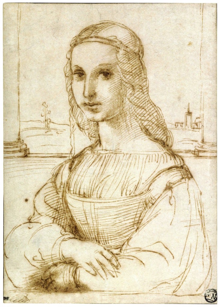
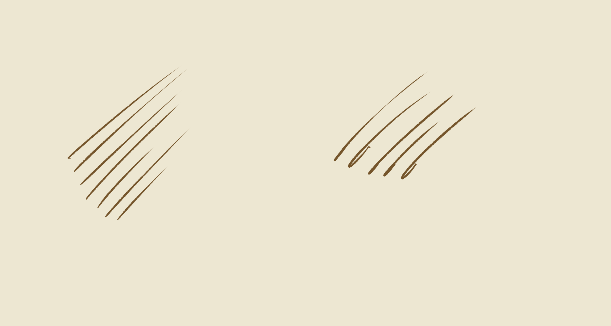
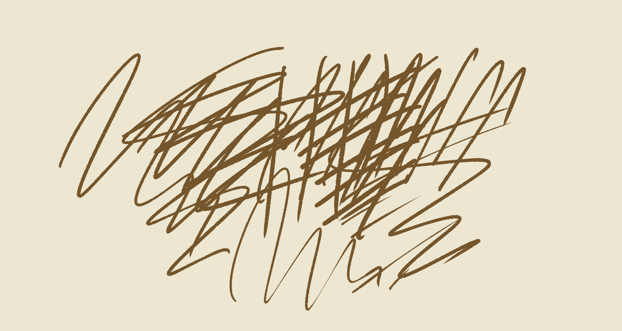
Lines have to follow some rules to cohere as hatching. First of all, they need to be straight. Not ruler-straight, but if they bend too much, they start grabbing form in a cross-contour way that isn’t the modeling effect you want. This is a Krita drawing with the Ink-4 Pen Rough brush selected and colors picked from the Raphael.
Second, sets of hatching lines should be parallel. Again, not protractor-parallel, but enough so they register as a unit. Sets of hatching lines that aren’t parallel tend to look like texture rather than shadow.
Third, the lines should be discontinuous. That is, don’t zigzag. I have seen two artists successfully zigzag: Sargent and Picasso. If you’re zigzagging and getting Sargent- or Picasso-level results, please ignore me and keep zigzagging. If you’re not, just draw discrete lines.
A common mistake in hatching is hooking the lines, which is related to zigzagging. There are, I concede, some hooked lines in the Raphael. I put a tiny hook on the first line in my left-hand example. (I blame the tablet. Okay, I blame the operator of the tablet.) It’s not a great sin. But if you let it get out of control, you may get non-shading effects that look cluttered.
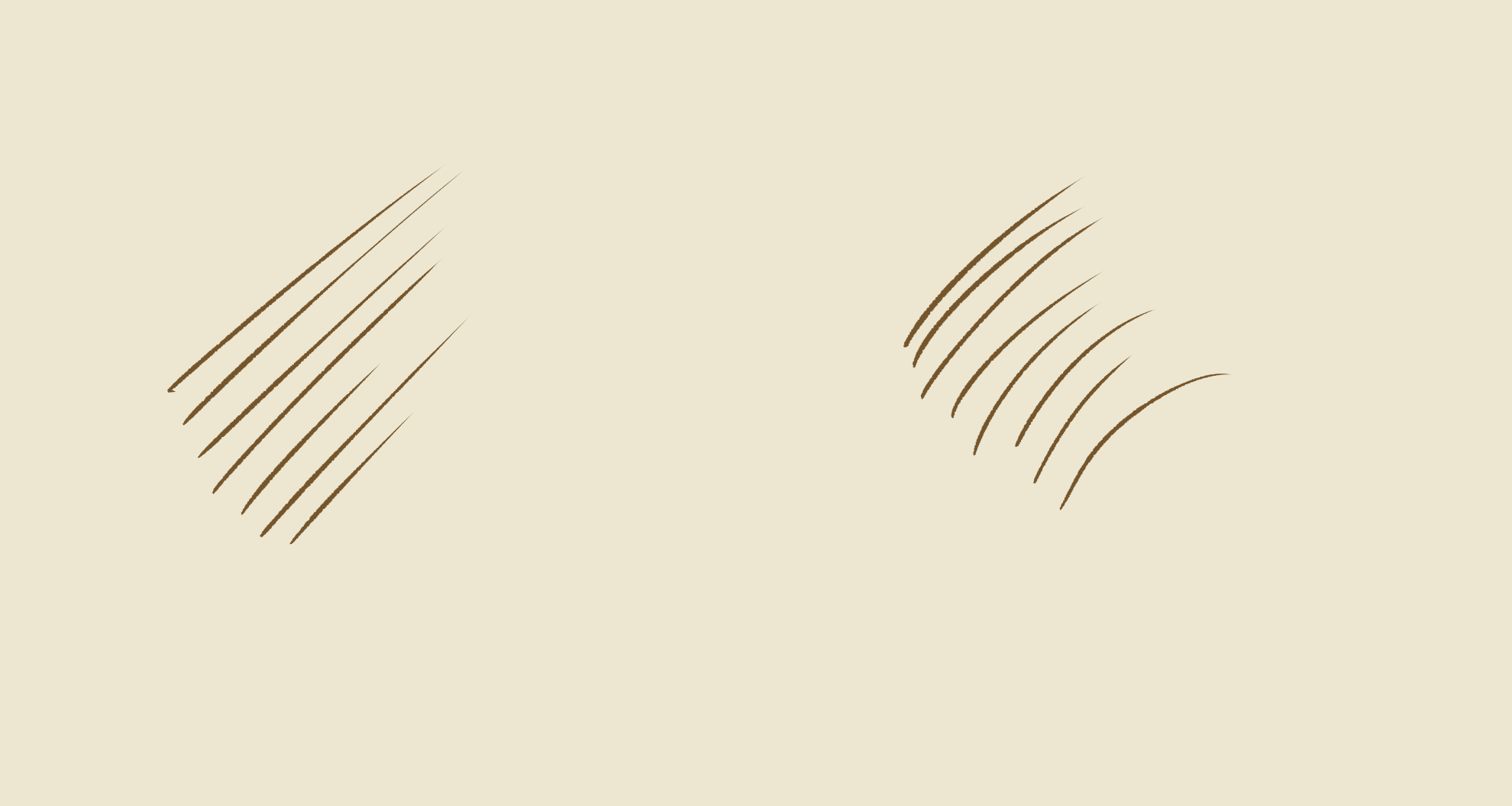
Fourth, the lines should be predictably spaced. Note that I didn’t write evenly, though in practice, “predictably” usually means “evenly.” If you look at the passage of shading from the temple to the cheekbone in the Raphael, you’ll notice the spacing gets a little denser around the eye socket. It also opens up around the peak of the cheekbone, which lets more light in. Raphael gets away with that because he’s modulating the changes in a way that isn’t surprising.
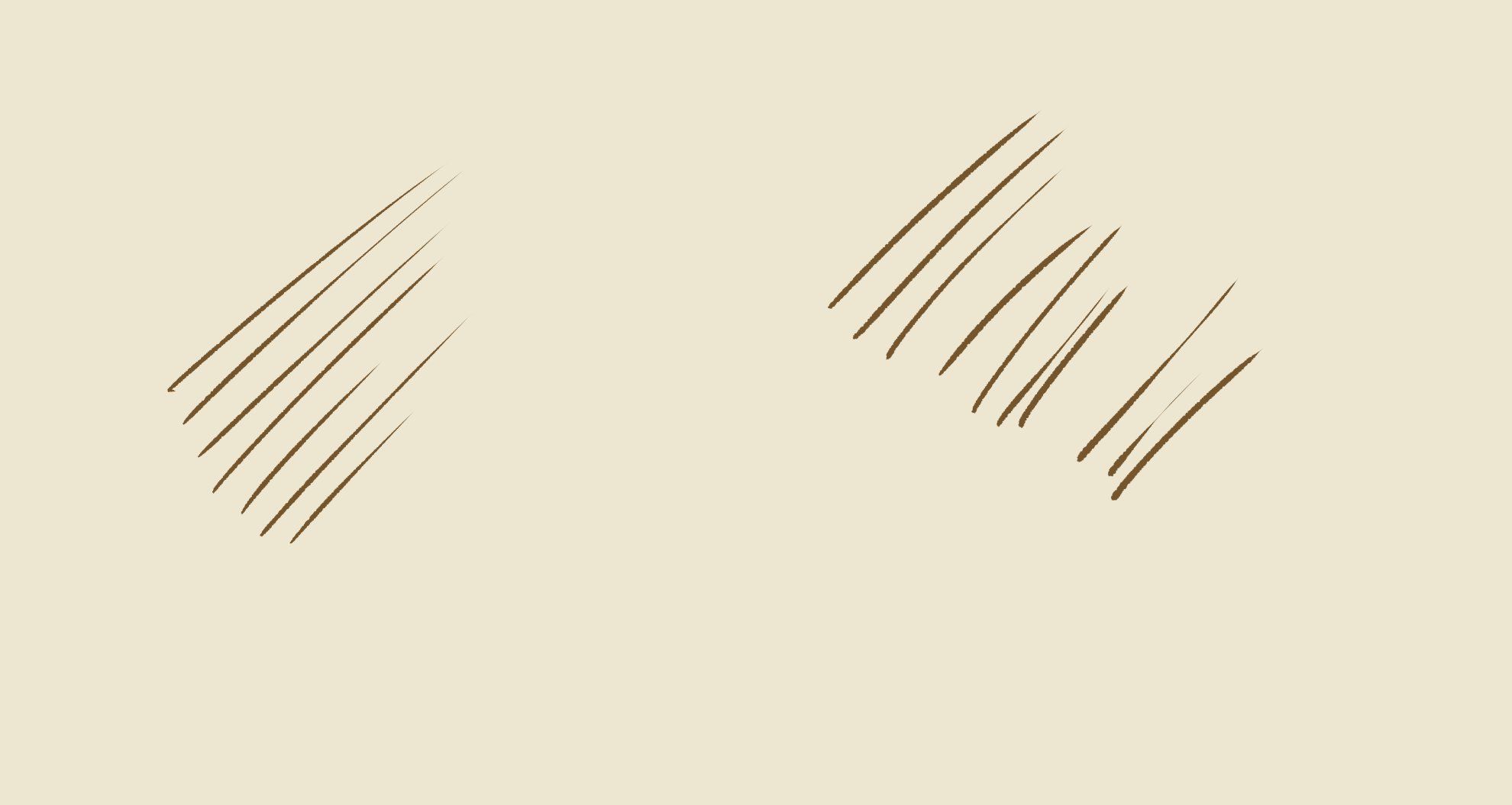
Fifth, the lines should taper. This is a product of line weight decreasing from the middle of the line to the end. Blunt hatch lines can work, but they tend to look like they’re on the form instead of being the form.

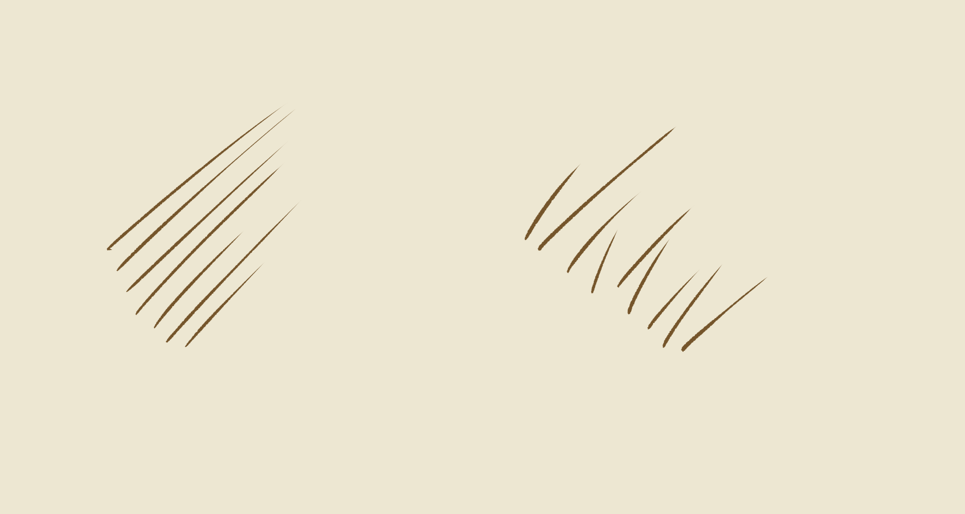
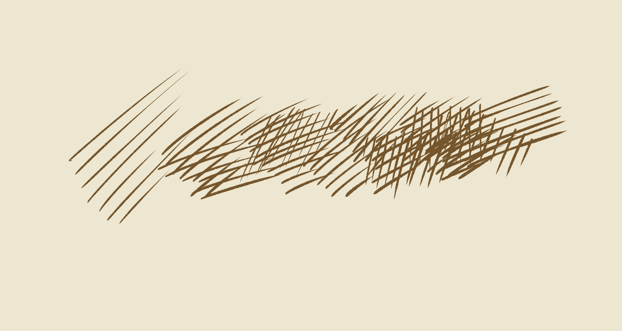
With those points in mind, there’s no particular trick to cross-hatching. Any lines that work as hatching will work as cross-hatching. The main problem to watch out for is that it’s possible to obliterate the paper or background, which I started to do on the right here. Sometimes that can look blotchy.
This is Michelangelo. It’s a chalk drawing, but the above applies.
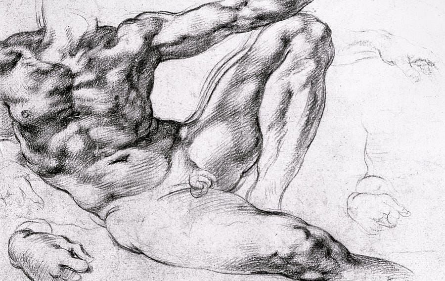
The converse point is also true—lines that don’t work as hatching tend to look like garbage as cross-hatching. The unwanted effects compound.
One way to drive the technique home is to draw a few thousand of these. I call it the Basic Ball. It’s an invented drawing of a sphere with four components: light, midtone, shadow, and cast shadow.
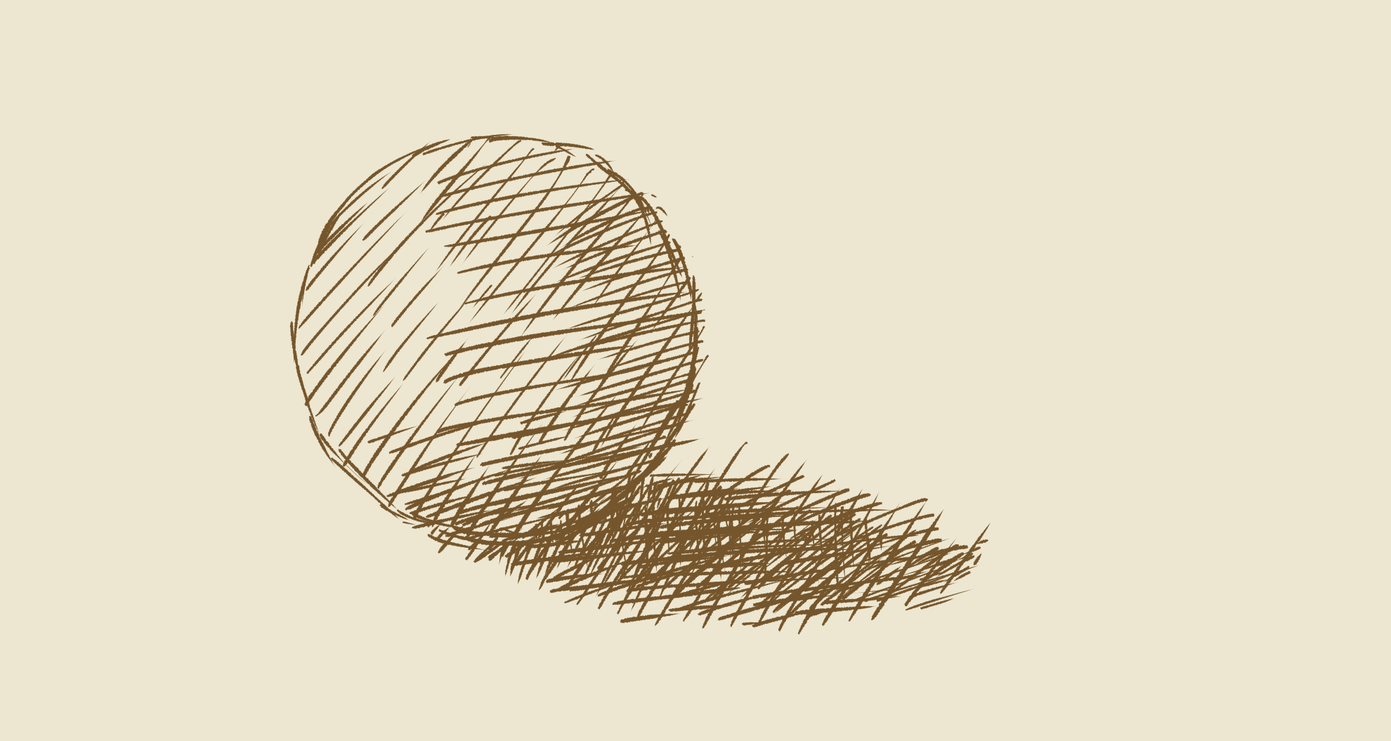
When you’re comfortable with that, upgrade to the Premium Ball, which adds a highlight to the light and a reflected light to the shadow. Note that this is entirely imaginary. Artists typically impose this scheme on the model even when working from life. Note also that getting a proper highlight in a drawing in dark ink on light paper is a mighty challenge. I’ll explain why shortly.

Most any Western drawing you see from 1400 to 1900 is an elaboration on the Premium Ball. This is an Andrea del Sarto. The head is either invented or adapted from another work. Notice the underside of his jaw, where del Sarto has bounced in some reflected light. Typically artists haven’t done this because they observed it, but because the six-part modeling system associated with the Premium Ball is good at conveying mass. This too is a chalk drawing, and it’s striking how often Renaissance artists would hatch with chalk even though it’s capable of tonal shading.
Back to pen and ink: here’s Michelangelo again. On a value scale, 1 being black or the maximum dark allowed by the medium and 10 being white or the maximum light allowed by the paper, what you can do with a pen in the 7 to 9 range is pretty restricted. This is why it’s hard to make proper highlights. Pen shines in the 2-6 range, where you can build up luminous shadows that let the paper show through. That’s a rich area to push on when you’re working in pen. You need a sharp steel pen, good drawing ink, and a decent sheet of paper to approach this.
 1494-96 Pen and brown ink, 292 x 200 mm Graphische Sammlung Albertina, Vienna")
Another artist who bears mentioning is Edward Gorey. Referring to our 1-10 value scale, it’s common for Gorey drawings to jump from 7 to 10. Anything approaching white is made white. The buildup is happening in the 1-7 range, with whites popping out like firecrackers. I have additional comments about his work in the review I wrote of the 2011 Gorey exhibition at the Boston Athenæum.
That’s a goodly portion of what you need to know about pen and ink, at least when it comes to hatching modeled form. I hope this has been helpful. Reach out with any questions.
Dissident Muse Journal is the blog of Dissident Muse, a publishing and exhibition project by Franklin Einspruch. Content at DMJ is free, but paid subscribers keep it coming. Please consider becoming one yourself, and thank you for reading.
Next titles in the Asynchronous Studio Book Club will appear shortly at the ASBC homepage.
The current exhibition in the Dissident Museum is Suddenly, A Tree Appeared: Marek Bennett, Greg Cook, Ansis Puriņš.
Dissident Muse Journal is publishing a serial comic, The Socialist Book of the Dead: A Graphic History of Collective Failure.
This is incredibly cool, and very useful!! Thank you!!
It is true that one can train oneself out of oneself. The Beginner's Mind: A mentor from long ago, a big shot bureaucrat in several presidential administrations, retired early to take up art. I watched as he proceeded. By the time he began, the habits he had to form in order to have had his career as a bureaucrat, were cemented. Nobody ever strove harder than him to make art, but those habits stood in the way of his ever being able to. A part of his efforts to mentor me was to counsel me that if I wanted to "be an artist," I had to have income, which meant employment. Watching him struggle showed me the trap, showed me that his counsel was exactly how not to proceed. Through the years I had odd jobs, painting houses, mowing lawns, honest labor, but nothing that would undo or interfere with the Beginner's Mind.
Once, a few years back I adjourned to my next door neighbors' home for Christmas dinner. On my arrival, one of their little boys, about 3 1/2 - 4 years old, grabbed my hand and exclaimed "I got cars!" So I went upstairs with him to his play room. He dug into a box full of toy cars and took some out and did some things with them. As I watched, I could see that the results of what he did with the cars suggested to him what he might do next. Then I saw that, instead of finishing anything, he abandoned the operation. The Beginner's Mind. Monet told someone that he left a painting when he reached a point where he didn't know what else to do with it.
With that in mind, it might've seemed counter-intuitive to me when I found that so-called "Abstract Expressionist" painters like de Kooning and Rothko exhorted younger artists to study the masters. But I had also encountered the idea, attributed to Picasso, that good artists copy: great artists steal. So, the trick is not to lose oneself in the shadow of the masters, the teachers, by imitating their techniques, but to absorb their lessons and transpose them by filtering them through one's own sensibilities. The result is something unique, something like one's hand writing, freshening and renewing the context, the tradition, by adding the next sentence, paragraph, chapter to the tradition. The Beginner's Mind is nonnegotiably requisite for that.